

Harley Street
Branding case study
Creating a new sense of place and purpose for Harley Street.
Rebranding of the well-known Harley Street Area
The client
The aim of the Harley Street Area Partnership (HSAP) is to become a business improvement district (BID), the first in a predominantly medical area in the UK. With a BID, an area’s businesses focus on sourcing local funding and investment to improve and enhance the commercial areas of the district, supporting each other and the area as a whole in order to increase the vibrancy and vitality of a district.
“Bruno and his team at Bell have been amazing since the tender process. They submitted a brilliant, competitive tender, really understanding the brief and being considerate of cost implications for a small business partnership. We were excited to be able to shortlist them and then see their ideas for our brand. We were delighted and really feel our new brand now represents the business and whole community in Harley Street in a slick and effective way. We are looking forward to forging our working relationship further when, we hope to achieve a positive ballot outcome, later in 2021”.
Nicki Palmer
Partnership Director - Harley Street
The challenge
Bell won a tender to develop a new brand, visual identity and website. Although best known for its medical practices, the HSAP wanted to move beyond – while still recognising the importance of the medical sector, the objective was to promote the area as a place to do business regardless of activity or sector, and also as a desirable place to visit. As well as partnership branding, this was a place making project.
The solution
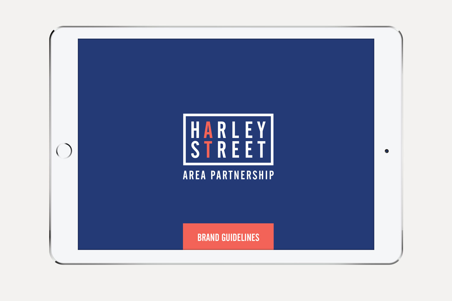
We began from a premise of avoiding devices or references that were stereotypically ‘medical’, and also focusing on the active (what is and will be happening at Harley Street) rather than the passive. Regarding medical references, the name Harley Street is synonymous with medicine, and by using the designation alone, we could reflect its storied medical history. And what is and will be happening at Harley Street is medical excellence and innovation and business excellence and innovation across other sectors.
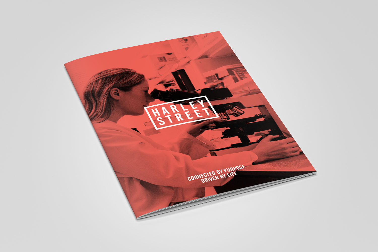
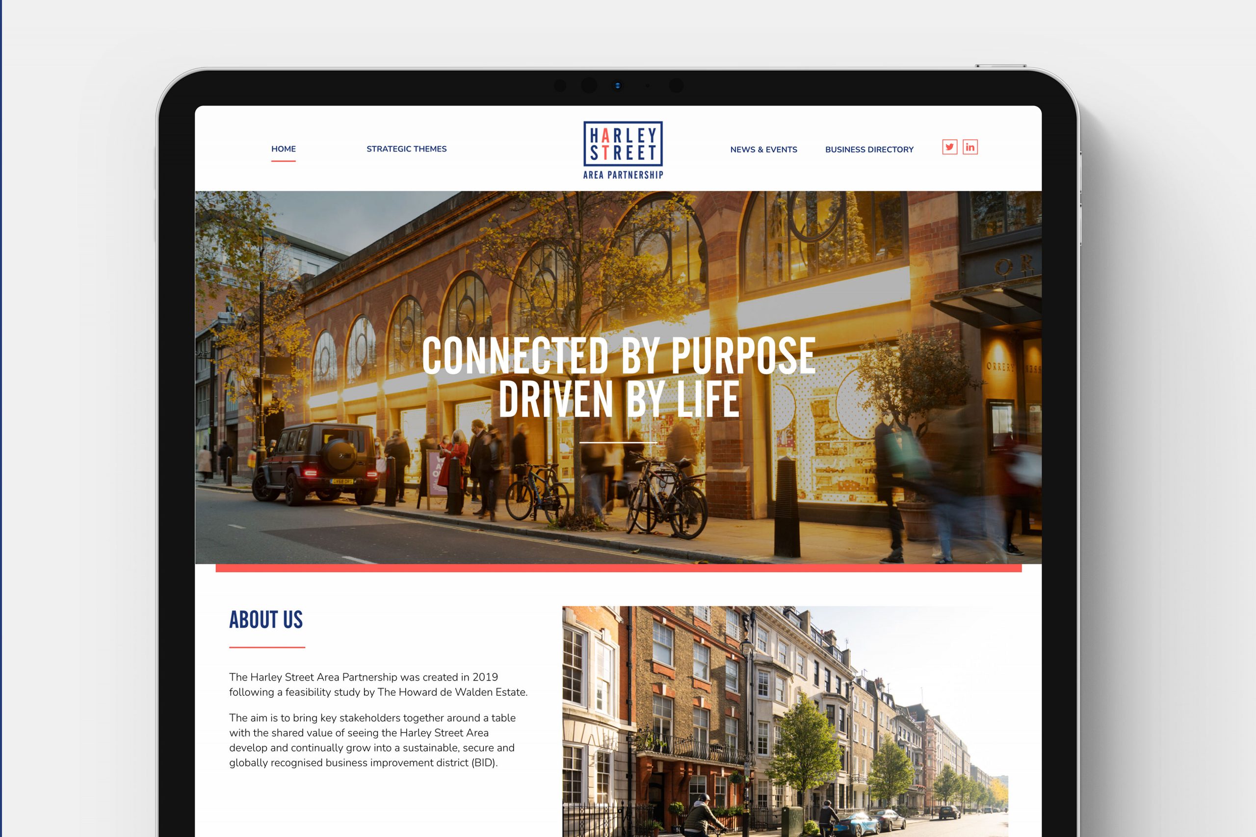
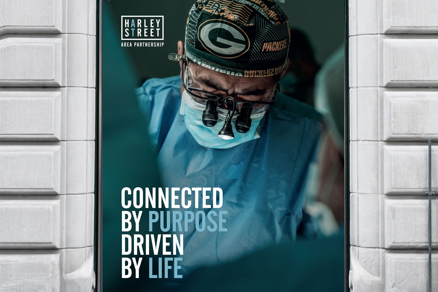
We developed a stacked logo using a modern, sans serif upper case typeface, in a style similar to London street signs, with a similar border. The identity and brand colours are red and blue. The “A” in Harley and “T” in street sat vertically when the words were stacked, and we used red letters here to contrast with blue so the overall device tricks you into reading it as “AT HARLEY STREET”. The term “Area Partnership” sits below.
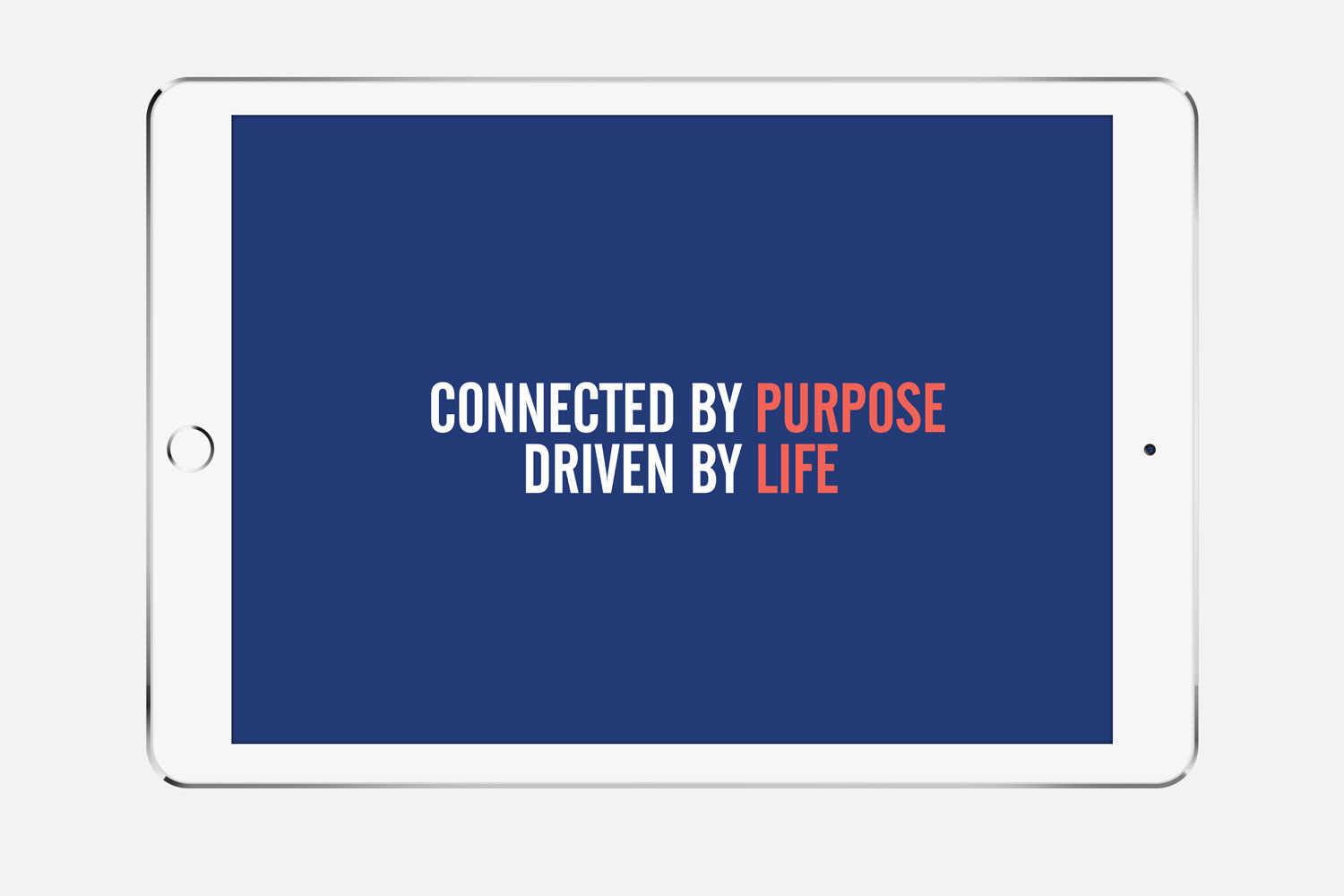
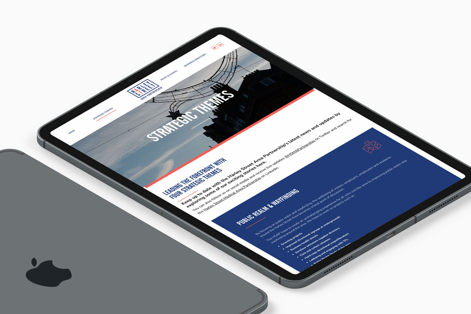
The key message for the BID is “Connected by purpose. Driven by life”, which subtly brings the medical heritage and innovation in whilst highlighting the essence of a BID, which is businesses working together with the common goal of improving an area. These themes were highlighted on the new website and in collateral applications.
Our creative
Other case studies
University of Reading
CREATIVE
Revolutionising student recruitment
AQA
ACQUISITION CAMPAIGN
Encouraging teacher switching in a sector noted for inertia
Get in touch
Got a project, question or want to have a chat?